
Tufts Medicine
A redesigned information architecture to support a consolidation of the Tufts Medicine digital experience into a single site.

🎉 fun fact!
I previously worked at Tufts Medical Center as a registered nurse in Oncology and Bone Marrow Transplant, so this project was very special to me, and I was excited to help design a brand new site for Tufts Medicine.
Background
Tufts Medicine is a large network of healthcare providers in Massachusetts working together to deliver exceptional care with a personal touch. The healthcare system is made up of five hospitals and hundreds of medical offices. With the new branding of Tufts Medicine, they asked us to design and develop a new website to reflect a unified mission and vision of "One Tufts Medicine".
Challenge
I was challenged with creating a new information architecture to organize the content of multiple sites with different identities into a consolidated and consistent experience in a single site.
Client Goals
- Grow the patient population
- Improve patient health
- Reduce financial anxiety of patients
- Educate the community and increase engagement
- Make patients' lives easier, saving them time and effort
- Recruit staff to provide quality healthcare
Client
My Role
- User research
- Information architecture
- Wireframing
- User Testing
Year
Discovery
The team conducted an extensive discovery for the new Tufts Medicine site which included stakeholder interviews, user interviews, surveys, and workshops. My primary focus was assisting with user interviews, and synthesizing the findings into a detailed client report.
user interviews
One of the main goals for the user interviews was to understand how participants became a Tufts Medicine patient and how they perceive Tufts Medicine as a whole. We learned about their experience by asking questions such as:
- What did Tufts Medicine do well?
- What could Tufts Medicine do better?
- What makes Tufts Medicine unique?
We also wanted to know how they found Tufts Medicine, especially if they’ve used the Tufts website and what they used it for, including any specific actions (e.g. find a doc, booking an appointment, paying a bill, etc). This was also important to understand what parts of the site they found to be most useful and what needed improvement.
Key Takeaways
- We have the opportunity to create a website patients and caregivers actually use.
- Patients rely on personal connections and digital communities to influence their choice in care team.
- Tufts leads the way in communicating with their patients.
- Customers want guidance and access to their health information at any time.
Patient Priorities
- Find a location that is conveniently located close to home.
- Easily find a doctor that is accepting new patients and accepts their insurance.
- Understand the process of what happens after a doctor retires.
- Schedule an appointment online for services or urgent care.
- Complete tasks on the website without needing to make a phone call.
- Be informed about emergency care and urgent care wait times.
- Learn more about the various ways to give back to Tufts Medicine.
Stakeholder Priorities
- Information is available in different languages.
- Increase usage of myTuftsMed patient portal.
- Provide easier access for donors to make donations.
- Robust event calendar with online registration for upcoming events.
- Generate more website traffic to the careers site.
- Unified branding with consistent messaging.
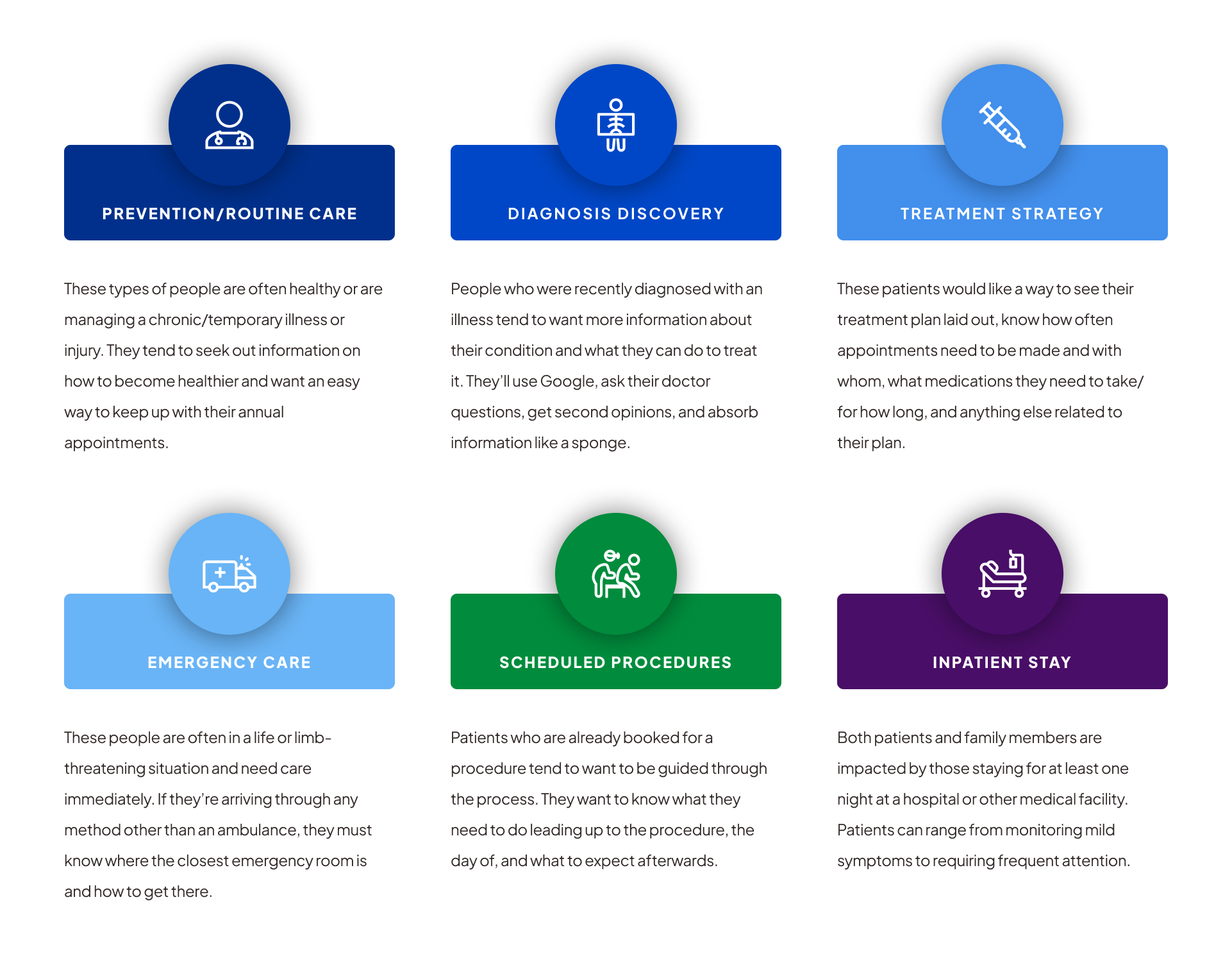
Health Missions
Because a healthcare system as large as Tufts Medicine sees nearly every type of person, it’s hard to separate them into useful personas without being too general. Instead, it’s much more impactful to group people by the types of care they’re seeking or receiving, even if it’s across different patient populations. This allows us to holistically look at their goals and apply them to our work.
Information Architecture
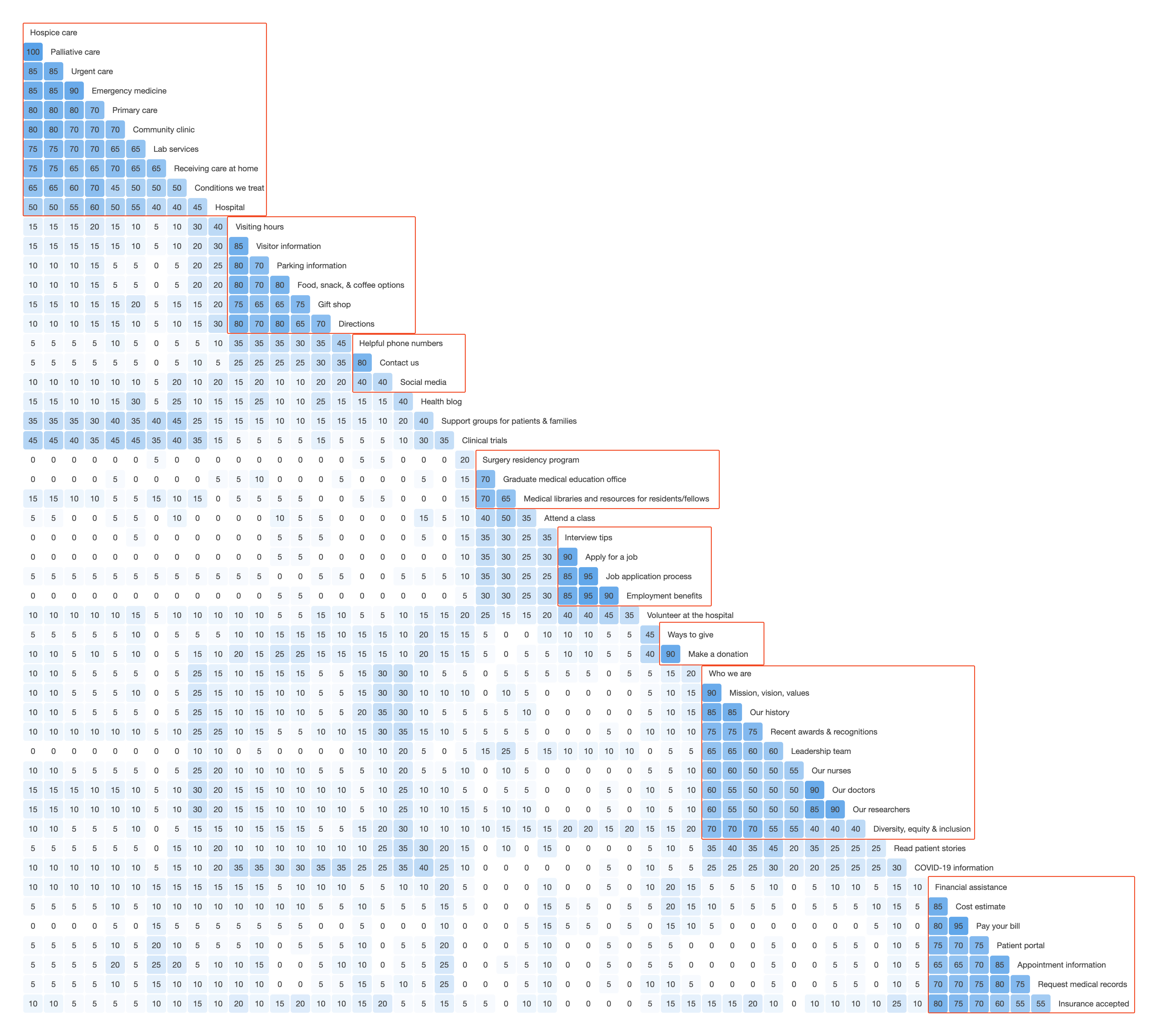
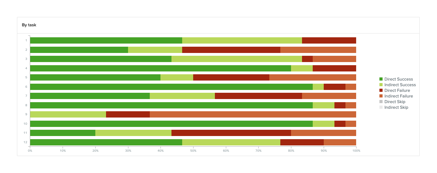
My main contribution to this project was to rework the information architecture to combine the five sites into a single site with a focus on "One Tufts Medicine". My work consisted of auditing the current IA of the different sites, conducting a card sort, creating the new IA, and then conducting a tree test to gain initial feedback from users.
Websites Audit

Card Sort
Information Architecture

Tree Test
Recommendations
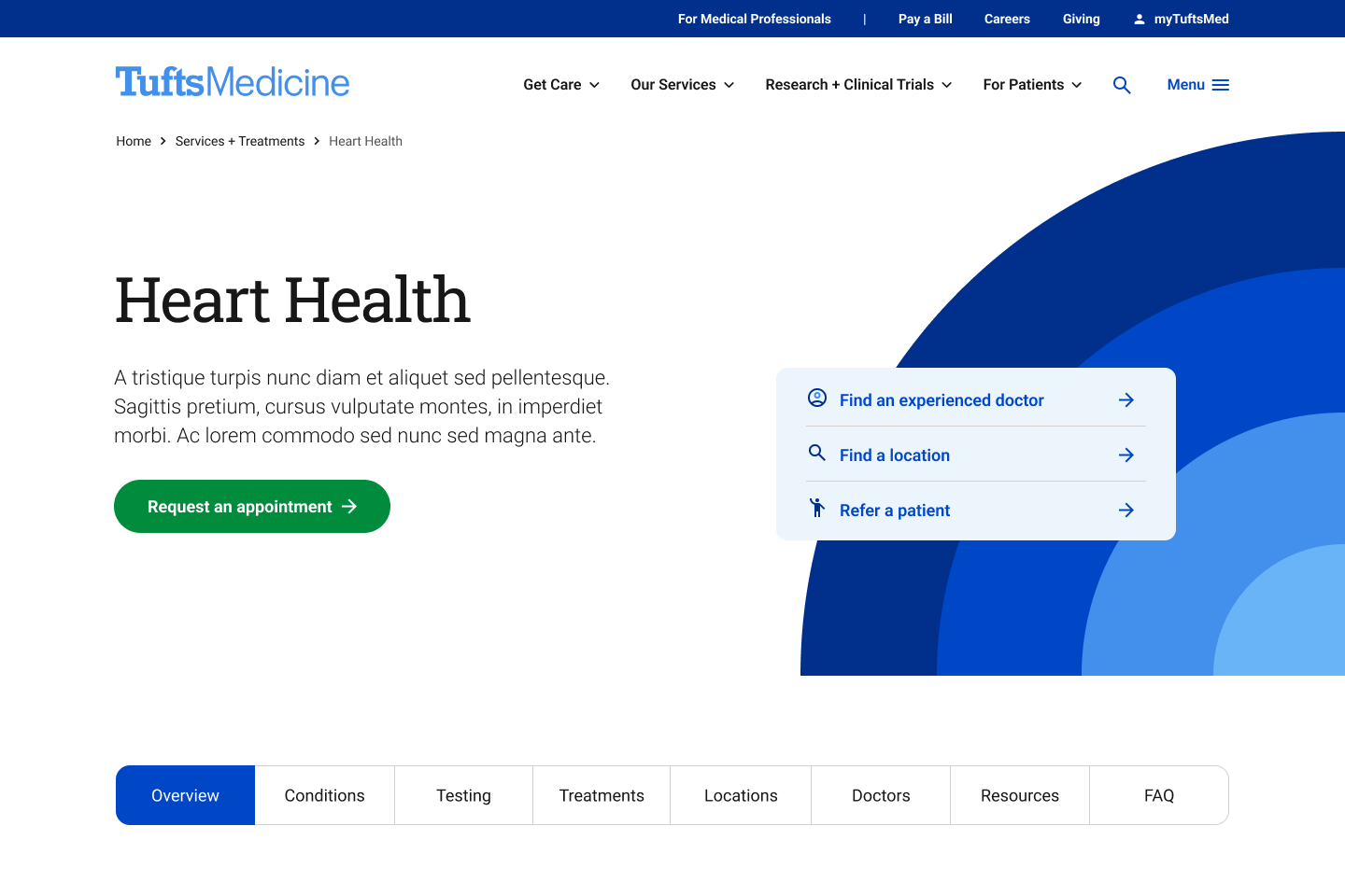
- Suggest adding a pathway to “Billing & Financial Resources” on the service pages.
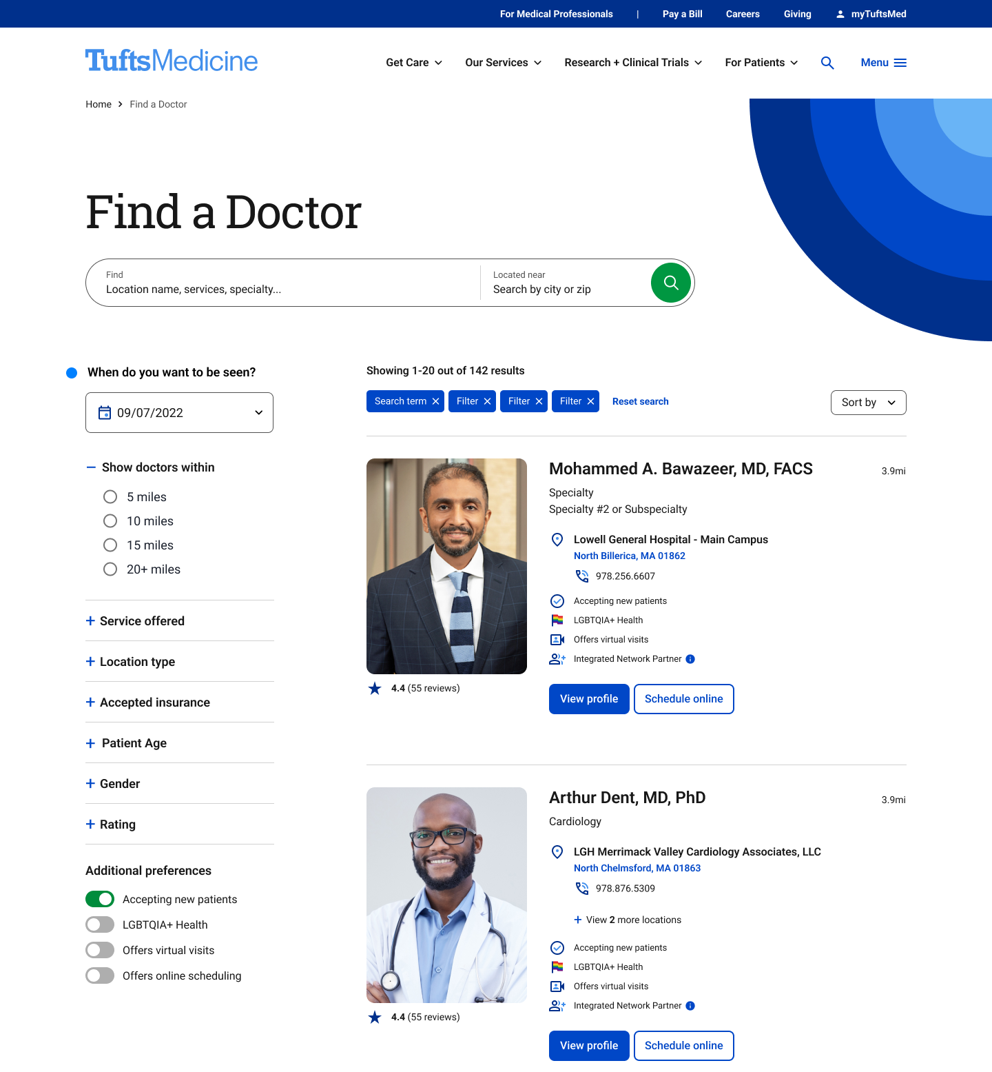
- Include filters such as: accepting new patients, specialty, and location to make it easier for patients to find a doctor. It’s very important to patients to know if the doctor is accepting new patients.
- Suggest including a pathway to “Plan Your Visit” or “Preparing for Your Surgery” on the service pages.
- Suggest including a pathway to “Find a Location” within “Plan Your Visit”.
- Include the “Visitor Information” that is also applicable to patients within “For Patients” because patients can also be considered visitors and they would also need to know where the closest hotel is located.
- Suggest including a landing page for “Giving” because participants expressed the want to be able to explore the various options that are available to give back to the hospital. They want a quick and easy way to donate, but they also want to be able to explore the giving section.
- Include pathways and content relating to “Diversity, Equity, & Inclusion” where applicable. Highlight the impact of DEI on various audiences: healthcare professionals, patients, visitors, etc.
- Suggest renaming “Newsroom” to “Latest News” to make it clear what type of news is found within this section.
Design
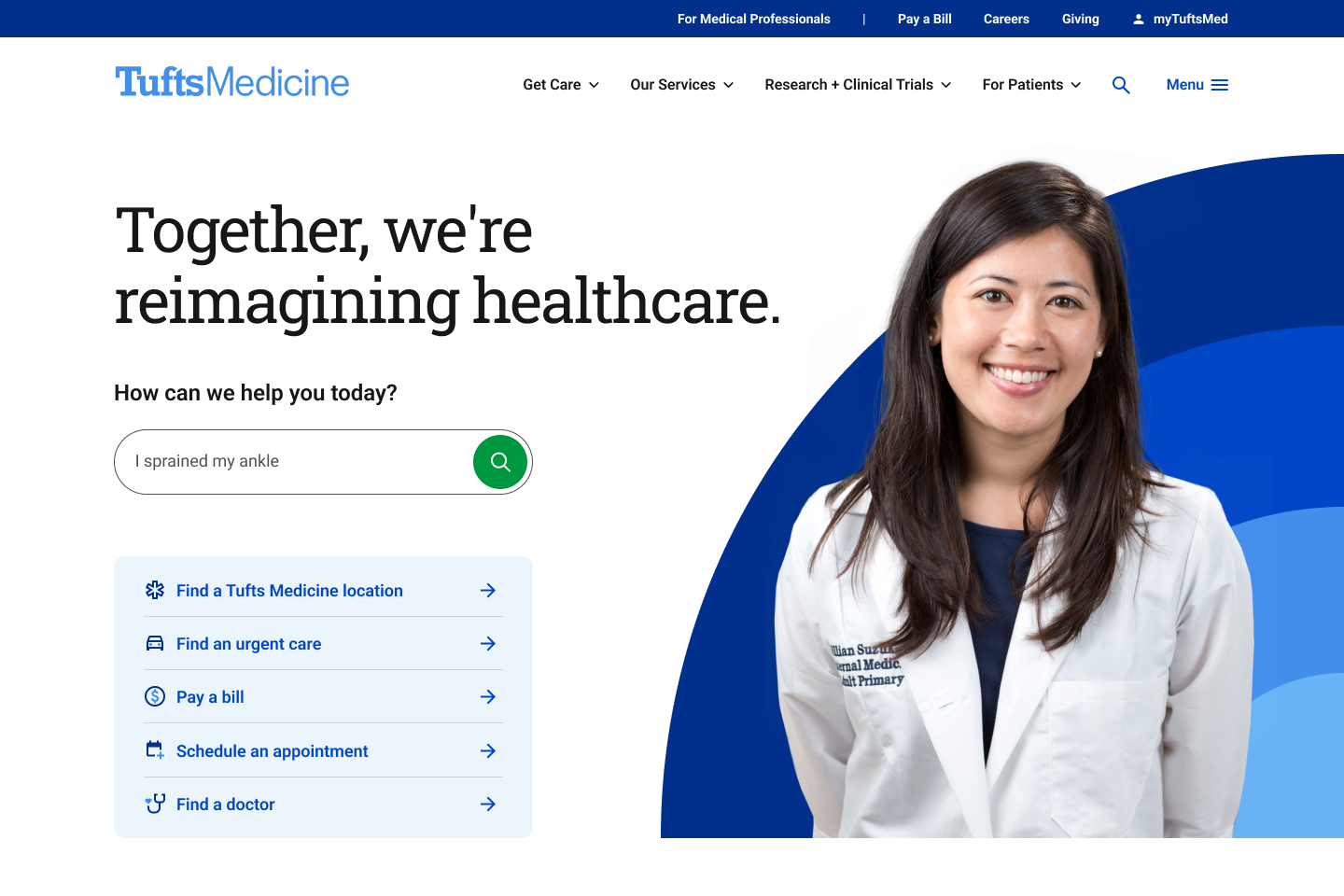
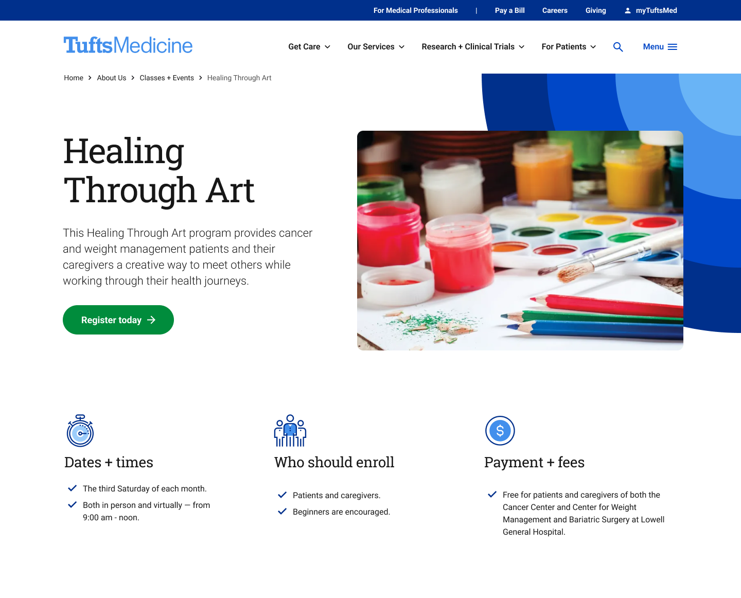
In collaboration with another UX Designer and a UI Designer, we created 80 high fidelity frames for both desktop and mobile. These wireframes were used by both our development team to build the final website as well as by the client to share with the broader Tufts Medicine network.
Test
Due to my past experience working at Tufts Medical Center as a registered nurse, I was tasked with specifically testing the education and training sections of the site. I created a high fidelity prototype in Figma and conducted user tests over Zoom with 3 prospective medical residents and 2 prospective fellows.
Resident Findings
- Look for hospitals with diverse patient population and a high patient volume to see as many types of cases as possible.
- Want to know about the location - attractions, restaurants, nightlife. Is there a housing stipend?
- Demographic info of past residents is important. What medical schools did they come from? What are they doing after residency?
Fellow Findings
- Location is not as important because some programs are only a year long.
- What opportunities are unique to this program? Is there a procedure that I'll only have the opportunity to do with this Fellowship program?
- Would like the patient population to have increased complexity to have more challenging cases.
Key Takeaways
- Some medical students would open the menu and then go to “Training + Education” under “For Medical Professionals”.
- Current residents would go to “For Medical Professionals” and expect to see Fellowship Programs as well as information for referring providers.
- Students and fellows would browse “Research Programs & Labs” first.
- Users would go to the “Education” tab on the homepage to see info about the medical school, residency programs and fellowship programs.
.png)
Let’s Skyrocket Your Next Project Together
Lorem ipsum dolor sit amet, consectetur adipiscing elit. Turpis scelerisque purus eu quis lacus, nibh pharetra.
