Designed an intuitive mobile navigation to allow for easy browsing between Michigan Medicine's four-site ecosystem.
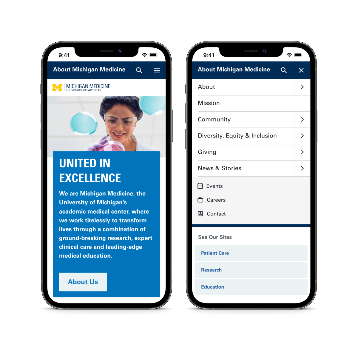
Michigan Medicine, University of Michigan's academic medical center, condensed their 300+ sites into a framework of four sites. The enterprise site represents Michigan Medicine as a whole, while the research, education, and patient care sites each represent one arm of the tripartite mission.
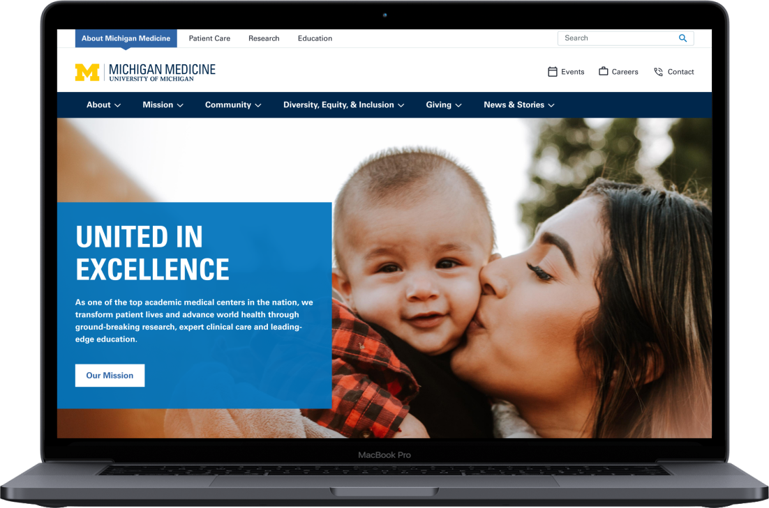
A desktop universal navigation was created to quickly navigate between the four sites without the user noticing, by maintaining a consistent top navigation and overall website experience.
I was challenged with designing a mobile navigation that enables users to seamlessly browse between Michigan Medicine's four-site ecosystem.
I was brought in to design the mobile navigation after the desktop navigation was already approved, so before I began I wanted to make sure I fully understood the research and considerations that went into the design. I met with the UX designer who created the desktop navigation and reviewed the research they had conducted.
The desktop navigation allows the user to quickly and easily navigate between Michigan Medicine's four-site ecosystem. The menu items change between the four sites, but the layout and design remains consistent. The main navigation is also a mega menu, and on hover the menu will open to expose the second level of information architecture to allow users to quickly navigate to the child pages.
Once I was up to speed on the research for the project, I brainstormed the different approaches we could take with the mobile navigation. I narrowed down the ideas into these two main approaches: tabs vs dropdown.
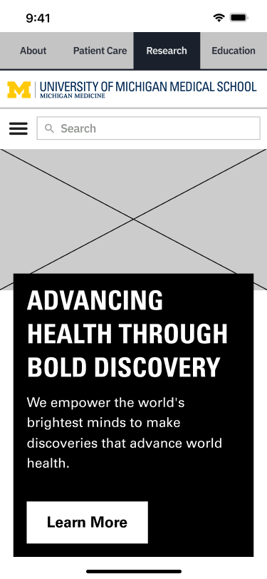
Version A - tabs
.png)
Version B - dropdown
I reviewed the wireframes with the larger internal team, including the developers, and we decided to move forward with the dropdown approach to prioritize usability and accessibility. The dropdown approach had a much larger touch target which would eliminate the concerns around misclicking of a tab.
The next step was to build out the wireframes for the dropdown, search, and hamburger menu, so the UI designers would be able to apply the designs.
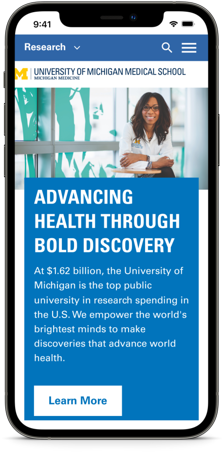
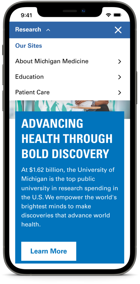
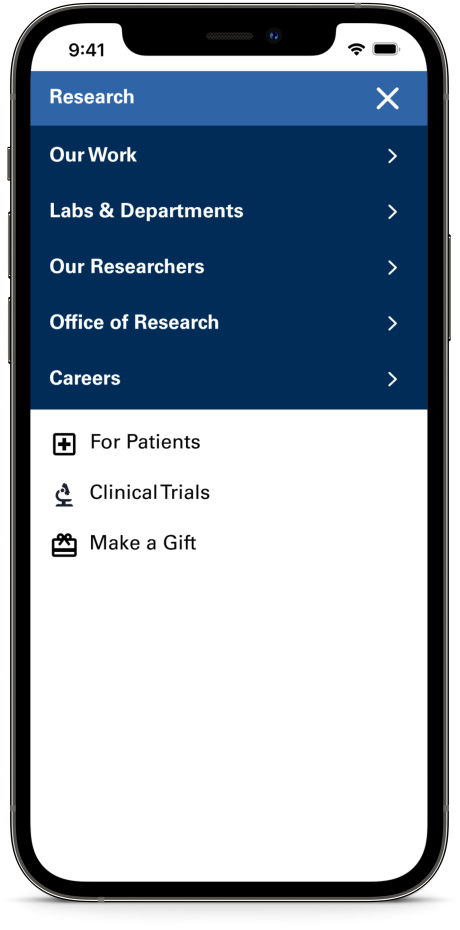
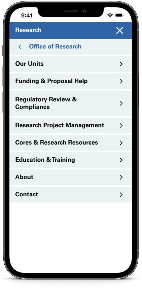
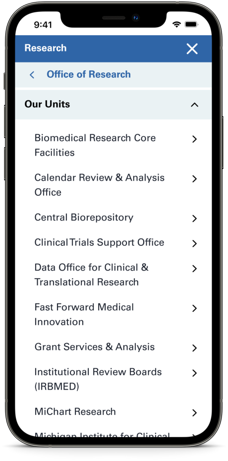
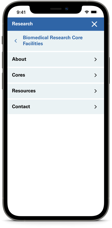
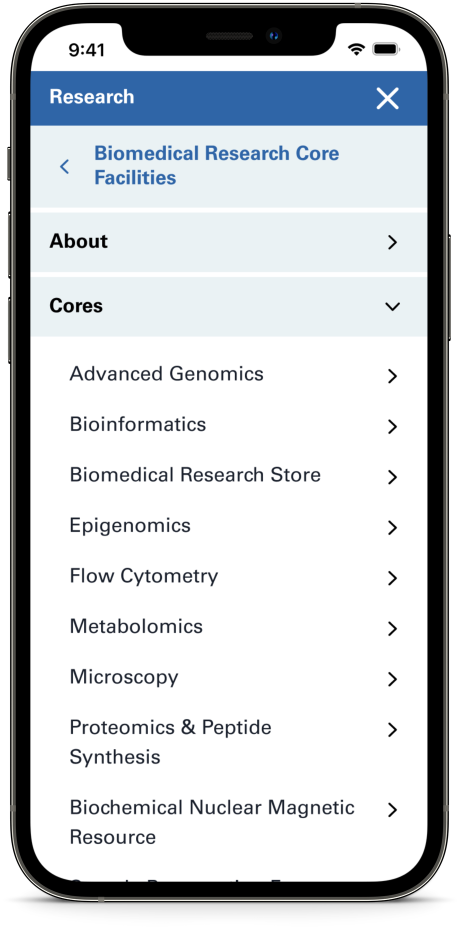
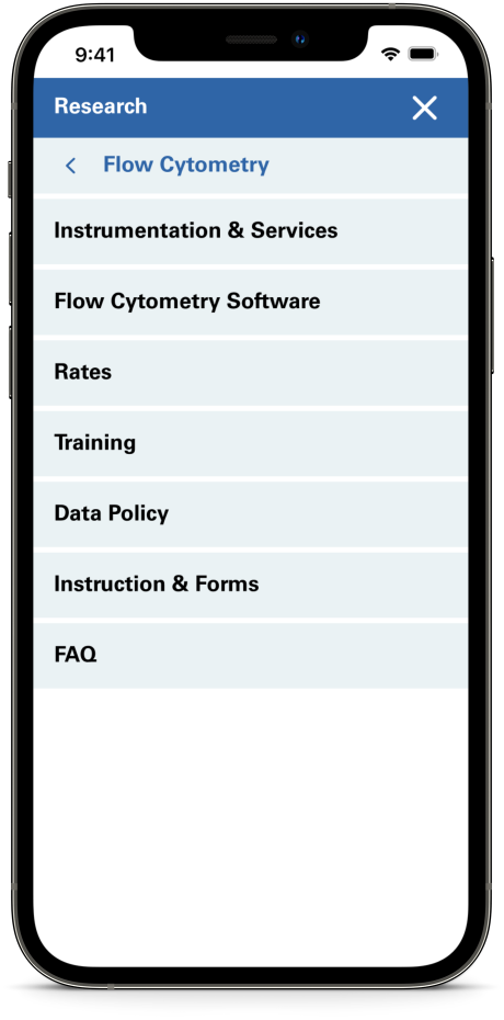
I first conducted unmoderated user tests using Maze.co to gather quick feedback on the overall usability and designs. Because we already conducted usability testing and received feedback on the enterprise and research sites, unmoderated testing was an appropriate methodology to evaluate the navigation I had developed by seeing if participants can complete various tasks.
I used UserInterviews.com to recruit 15 participants who have received healthcare in or out of a hospital or doctor’s office in the last 6 months.
Rethink the universal navigation. Most users went to the hamburger menu for the task “Please open the menu that shows the other sites within Michigan Medicine", so the universal navigation menu should be included within the hamburger menu. The hamburger truly seems like the go-to starting point for users.
Based on the feedback received during moderated testing, the following changes were made to the designs:
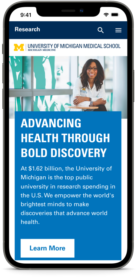
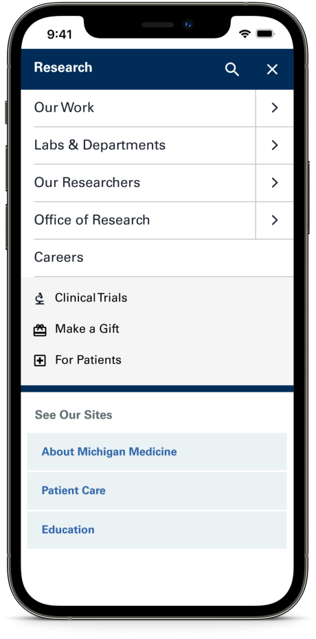
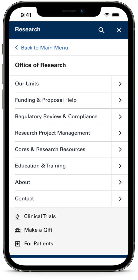
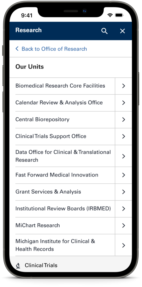
Once the updated design was complete, I created a high fidelity prototype in Figma to conduct moderated user tests remotely over Zoom. I used this moderated testing to gather insights on how the participants feel about the overall experience, test my assumptions about what worked well, and test the revisions that have been made.
I used UserInterviews.com to recruit 8 participants who have received healthcare in or out of a hospital or doctor’s office in the last 6 months.

Overall, my biggest takeaway from this project was the value of moderated user testing. While it was useful to gain quick initial feedback from unmoderated testing, the feedback received from moderated testing was more robust and comprehensive. Moderated user testing allowed for spontaneous discussion into how users think about and use the Michigan Medicine site. Being able to ask follow up questions and uncover unexpected insights from users produced useful findings and recommendations that helped inform the final mobile navigation design.


.png)